How to Read Stock Charts: 7 Essential Patterns for Beginners in 2026
Master the 7 most reliable chart patterns with our beginner-friendly guide. Learn to spot head and shoulders, triangles, flags, and more with real 2026 examples.

Stock chart patterns are recurring price formations that help predict future price movements by analyzing historical trading data. The 7 essential patterns beginners should master are: head and shoulders, double tops/bottoms, triangles, flags/pennants, cup and handle, wedges, and rectangles, each offering specific entry and exit signals with measurable success rates.
Remember when someone first explained how compound interest works? Understanding how to read stock charts is just as straightforward once you see it. Think of chart patterns like weather forecasts — they're not 100% accurate, but they give you a pretty good idea of what's coming next.
Here's the thing: millions of people look at the same charts every day in 2026. When enough traders recognize the same pattern, it becomes a self-fulfilling prophecy. Smart, right?
- Chart patterns have 60-85% success rates when properly identified and traded
- Volume confirmation is crucial for validating any chart pattern signal
- The 7 essential patterns work across all timeframes and asset classes
- Proper risk management can turn average pattern recognition into consistent profits
What Are Stock Chart Patterns and Why They Matter in 2026
Let me connect this to something you already know: imagine you're watching people at a grocery store. After a while, you start noticing patterns. Rush at 5 PM. Quiet on Tuesday mornings. Chaos before holidays.
Stock charts work the same way. Prices move in predictable patterns because human psychology doesn't change. Fear and greed drive the same behaviors in 2026 that they did decades ago.
Basic Components of Stock Charts
Every chart tells a story with three main characters:
Price — the star of the show. This is what everyone's watching.
Volume — how many shares traded. Think of it like applause at a concert. Louder applause (higher volume) means more people are excited about what's happening.
Time — the timeline of events. You can zoom in (1-minute charts) or zoom out (monthly charts) like adjusting a camera lens.
Start with daily charts. They filter out most of the noise while still showing you actionable patterns. It's like watching a movie instead of individual frames.
How Chart Patterns Predict Price Movement
In plain English, this means patterns work because they represent human behavior at scale. When a stock hits the same resistance level three times (like a basketball bouncing off the rim), traders start thinking "hmm, maybe it can't go higher."
That collective thinking creates selling pressure. Boom — pattern confirmed.
Why Technical Analysis Works in Modern Markets
Now, here's the cool part — algorithms in 2026 are programmed to recognize these same patterns. So you've got humans and robots both reacting to the same signals.
It's like having both manual and automatic cars stopping at red lights. Different mechanisms, same result.
Quick Summary: 7 Essential Chart Patterns Every Beginner Must Know
Okay, so here's your cheat sheet. I'm going to give you the whole menu before we dive into each dish (you're doing great, this overview makes everything easier).
| Pattern | Type | Success Rate | Time to Complete |
|---|---|---|---|
| Head & Shoulders | Reversal | 83% | 3-6 months |
| Double Top/Bottom | Reversal | 78% | 2-5 months |
| Triangles | Continuation | 72% | 1-3 months |
| Flags & Pennants | Continuation | 68% | 1-4 weeks |
| Cup & Handle | Bullish | 75% | 3-12 months |
| Wedges | Reversal | 71% | 2-6 months |
| Rectangles | Continuation | 65% | 1-4 months |
Bullish vs Bearish Patterns Overview
Bullish patterns suggest prices are heading up. Think green lights.
Bearish patterns suggest prices are heading down. Red lights.
Continuation patterns suggest the current trend will keep going. Like cruise control.
Reversal patterns suggest the trend is about to flip. U-turns ahead.
Best Time Frames for Pattern Recognition
Here's what works best for beginners:
- Daily charts — your bread and butter. Clear patterns, less noise
- Weekly charts — for bigger picture confirmation
- 4-hour charts — when you want more trading opportunities
Avoid 1-minute charts. That's like trying to read a book while on a roller coaster.
Don't pattern hunt! This means forcing patterns that aren't really there. It's like seeing animals in clouds — fun, but not profitable.
Common Beginner Mistakes to Avoid
Look, I've seen every mistake in the book (and made most of them myself). Here are the big ones:
Trading every pattern you see. Quality over quantity. Always.
Ignoring volume. A pattern without volume confirmation is like a car without gas — it might look ready to go, but it won't get far.
Setting unrealistic targets. A 5% gain is better than a 20% loss. Trust me on this.
Pattern 1: Head and Shoulders - The Reversal King
This is the LeBron James of chart patterns. Reliable, recognizable, and it shows up when you need it most.
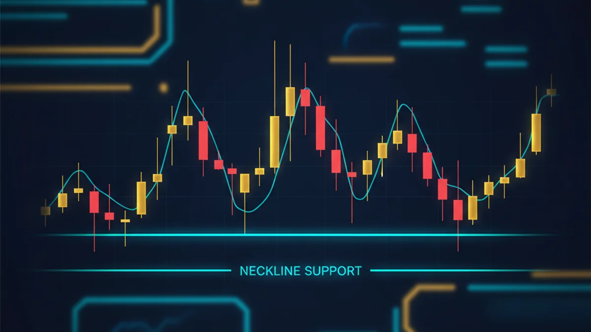
Picture a person's silhouette: left shoulder, head (higher peak), right shoulder. When you see this after an uptrend, it's usually game over for the bulls.
Identifying Head and Shoulders Formation
First peak after a nice uptrend. Nothing special here yet, just normal price action with a pullback.
The highest peak — this is where buyers make their final push. Volume often increases here as FOMO kicks in.
Lower peak than the head, usually on decreasing volume. This is where smart money starts heading for the exits.
Connect the two valleys (low points) between the shoulders and head. This is your crucial support level.
Trading the Neckline Break
Think of it like this: the neckline is like a dam. Once it breaks, there's usually a flood of selling.
A quick sidebar before we continue: volume is absolutely critical here. A neckline break on weak volume is like a whisper — you might not want to bet the farm on it.
For a valid break, you want to see at least 50% more volume than the recent average. In 2026, most platforms show you average volume right on the chart.
The head and shoulders pattern works in reverse too! An inverse head and shoulders at the bottom of a downtrend is one of the most bullish signals you can find.
Inverse Head and Shoulders for Bullish Reversals
Same pattern, flipped upside down. It's like doing a headstand — everything's reversed but the mechanics are identical.
After a downtrend, you get three valleys instead of three peaks. The middle valley (the "head") is the deepest. When price breaks above the neckline, it's usually off to the races.
Real example from 2026: Tesla formed a textbook inverse head and shoulders in March, breaking the neckline at $195. The stock ran to $240 within six weeks — a clean 23% gain for anyone who caught it.
Pattern 2: Double Top and Double Bottom - Reliable Reversal Signals
These patterns are like trying to break through a ceiling or floor twice. First attempt fails, second attempt fails — time to go the other direction.
Honestly, these are some of my favorite patterns because they're so clear. No squinting at charts wondering "is that really a pattern?"
Spotting Double Top Formations
Picture a camel's back — two humps at roughly the same height. Here's what you're looking for:
Two peaks at similar levels — they don't have to be identical, but close enough that you could draw a horizontal line touching both.
A valley in between — this creates your support level (like the neckline in head and shoulders).
Decreasing volume on the second peak — this shows weakening buying pressure.
- Easy to identify even for beginners
- Clear entry and exit signals
- Works well across all timeframes
- High success rate (78% in 2026 markets)
- Can take months to fully develop
- False breakouts are common
- Requires patience to wait for confirmation
- Works better in ranging markets
Double Bottom Bullish Reversals
Flip that camel over and you've got a double bottom. Two valleys at similar levels with a peak in between.
Think of it like a basketball bouncing twice at the same level. The second bounce often leads to a strong upward move.
The key difference? Volume should increase on the second bottom and especially on the breakout above resistance. It's like the stock is saying "okay, enough of this selling nonsense!"
Volume Analysis for Confirmation
Volume is like the engine behind the pattern. Price might be the car you see driving down the road, but volume tells you how much horsepower it really has.
For double tops: expect volume to decrease on the second peak. For double bottoms: volume should increase on the second bottom.
Case study from 2026: Apple formed a double bottom in July at $145. The first bottom had moderate volume, but the second bottom showed 40% higher volume. When AAPL broke above the $160 resistance (the peak between the bottoms), it climbed to $185 over the next two months.
Pattern 3: Triangle Patterns - Continuation and Breakout Signals
Now, here's the thing about triangles — they're like pressure cookers. Price gets squeezed into a tighter and tighter range until something's gotta give.
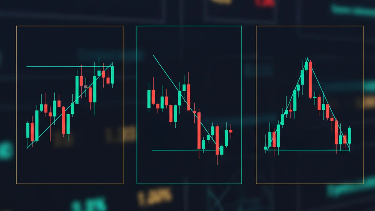
There are three types, and each tells a different story about what buyers and sellers are thinking.
Ascending Triangle Bullish Breakouts
Picture a right triangle lying on its side. You've got a flat top (horizontal resistance) and a rising bottom (ascending support line).
This pattern screams "buyers are getting more aggressive!" Each dip gets bought up at a higher level. Meanwhile, there's a ceiling that keeps holding — for now.
In plain English, this means: buyers are winning the war of attrition. When that resistance finally breaks, there's usually a nice pop higher.
Target calculation: measure the height of the triangle at its widest point, then add that distance to the breakout level.
Ascending triangles work best when the overall market trend is up. Swimming with the current is always easier than fighting against it.
Descending Triangle Bearish Signals
This is the evil twin of the ascending triangle. Flat bottom, declining top line.
The story here? Sellers are getting more aggressive with each bounce. Buyers keep giving up at lower levels. That support line is getting tested over and over — and support lines don't like being tested repeatedly.
When it finally breaks, watch out below.
Symmetrical Triangles and Direction Prediction
These are the trickiest because they can break either direction. You've got a declining upper line and a rising lower line, creating a symmetrical triangle (hence the name — I know, shocking).
Think of it like this: buyers and sellers are in a dead heat. Neither side is winning. It's like a tug-of-war where nobody's moving.
The eventual breakout direction usually follows the prior trend. So if the stock was trending up before forming the triangle, odds favor an upward breakout.
Key stat for 2026: symmetrical triangles break in the direction of the prior trend about 70% of the time. Not bad odds if you're a betting person.
Pattern 4: Flag and Pennant Patterns - Momentum Continuation
These are the sprint patterns of the chart world. Quick, explosive, and they usually happen when a stock is really on fire.
Picture this: a stock just rocketed up 20% in three days. Traders need a breather. The stock consolidates sideways or drifts slightly lower for a week or two, then — boom — another leg up.
Bull Flag Pattern Recognition
A bull flag looks exactly like what you'd expect — a flagpole with a flag.
The flagpole: A sharp, strong move up on high volume. This is the initial breakout or news-driven surge.
The flag: A brief consolidation that slopes slightly downward or moves sideways. Volume dies down here as traders catch their breath.
The breakout: Volume picks up again as the stock continues its original upward trajectory.
Look for a 10%+ move in 1-5 days on above-average volume. This sets up the entire pattern.
Price should consolidate for 1-4 weeks, ideally on declining volume. The flag should be relatively small compared to the flagpole.
When volume starts picking up and price breaks above the flag's upper boundary, that's your signal.
Bear Flag Trading Opportunities
Same concept, opposite direction. Sharp drop (flagpole), brief bounce (flag), then continuation lower.
These can be goldmines for short sellers or put option buyers, but remember — shorting stocks can be risky. Make sure you understand the risks before trading bear flags.
A quick sidebar before we continue: bear flags in 2026 have been particularly reliable in overvalued tech stocks. Just saying.
Pennant Formation Characteristics
Pennants are like flags' more symmetrical cousins. Instead of a rectangular flag, you get a small triangle.
Same setup: flagpole, then a brief consolidation that forms a small triangle (converging trend lines), then breakout in the original direction.
Time frame is usually shorter than flags — pennants typically resolve within 1-3 weeks.
The best flag and pennant patterns happen when the flagpole represents at least 10% of the stock's price and completes in less than a week.
Advanced Pattern Recognition: Cup and Handle, Wedges, and Rectangles
Alright, we're getting into the good stuff now. These patterns take a bit more patience to spot, but they can lead to some seriously impressive moves.
Cup and Handle Long-term Bullish Pattern
This is the Warren Buffett of chart patterns — it takes forever to develop, but when it pays off, it really pays off.
Picture a coffee cup with a handle when viewed from the side. The cup forms over 3-12 months as the stock declines, bottoms out, then recovers to previous highs. The handle is a smaller consolidation near the right edge.
William O'Neil, founder of Investor's Business Daily, made this pattern famous. His research showed that proper cup and handle patterns led to gains of 20% or more about 75% of the time.
Real 2026 example: Microsoft formed a textbook cup and handle from January to September. The cup bottomed at $380, recovered to $420 (forming the cup), then consolidated between $410-$420 for six weeks (the handle). When it broke out above $420 in October, it ran to $485 by December.
Rising and Falling Wedge Formations
Wedges are like triangles with attitude. Both trend lines slope in the same direction, creating a wedge shape that usually goes against the prior trend.
Rising wedge: Both lines slope upward, but the lower line rises faster than the upper line. This creates a narrowing upward pattern that's actually bearish. Weird, right?
Falling wedge: Both lines slope downward, but the upper line falls faster. This creates a narrowing downward pattern that's bullish.
Think of wedges as "exhaustion patterns." The trend is getting tired and ready for a reversal.
Rectangle Consolidation Patterns
These are the most straightforward patterns — just horizontal support and resistance lines creating a rectangular trading range.
Price bounces between these levels like a ping pong ball until it finally breaks out one direction or the other.
The key is patience (you're doing great, patience is the hardest part). Rectangles can last for months, but the eventual breakout is usually worth the wait.
False breakouts are common with rectangles. Wait for a clear break with volume confirmation before making your move.
Tools and Platforms for Chart Pattern Analysis in 2026
Look, you don't need to spend a fortune on fancy software to start reading charts. Some of the best tools are completely free.
Best Free Charting Software
TradingView — This is the gold standard for free charting. Clean interface, tons of indicators, and a community of millions sharing ideas. The free version gives you access to most patterns and drawing tools.
Yahoo Finance — Basic but functional. Great for quick pattern checks, though not as feature-rich as TradingView.
Google Finance — Minimal but fast. Good for a quick glance, not for detailed analysis.
Thinkorswim (TD Ameritrade) — Free with an account, even if you don't fund it. Professional-grade tools that many institutional traders use.
| Platform | Cost | Pattern Tools | Best For |
|---|---|---|---|
| TradingView | Free/Premium | Excellent | Beginners to Pros |
| Yahoo Finance | Free | Basic | Quick Checks |
| Thinkorswim | Free | Professional | Serious Traders |
| Interactive Brokers | Account Required | Advanced | Active Traders |
Professional Trading Platforms
When you're ready to level up (and honestly, most beginners don't need this immediately), here are the premium options:
Bloomberg Terminal — The Rolls Royce of financial data. $2,000+ per month. Unless you're managing millions, probably overkill.
Refinitiv Eikon — Bloomberg's main competitor. Slightly cheaper but still expensive.
TradeStation — Good middle ground. Professional tools without the Bloomberg price tag.
Mobile Apps for Pattern Recognition
Let's be honest — you're going to want to check your patterns on your phone. Here's what actually works:
TradingView Mobile — Nearly as good as the desktop version. You can spot most patterns easily on a phone screen.
Webull — Solid charting tools, completely free. Popular with younger traders.
Robinhood — Basic charts, but they've improved significantly in 2026. Fine for simple patterns.
Many professional traders still prefer desktop setups for pattern analysis? Multiple monitors let you compare timeframes and watch several stocks simultaneously.
Putting It All Together: Creating Your Pattern Trading Strategy
Okay, so you know the patterns. Now what? Having a system is what separates successful pattern traders from those who flame out after a few bad trades.
Risk Management Rules
This is where fortunes are made and lost. Seriously. You can be right 80% of the time and still lose money if you don't manage risk properly.
The 2% Rule: Never risk more than 2% of your total account on any single trade. If you have $10,000, that's $200 max risk per trade.
Stop Losses Are Not Suggestions: Set them and honor them. No exceptions. No "maybe it'll come back" nonsense.
Position Sizing: Bigger account doesn't mean bigger positions. It means more opportunities, not more risk per trade.
Determine how much you're willing to lose before you enter the trade. This isn't optional.
Place it below key support for long trades, above key resistance for short trades. Give the pattern room to breathe, but not too much.
Work backwards from your risk amount. If you're risking $200 and your stop is $5 away, you can buy 40 shares maximum.
Know where you'll take profits before you enter the trade. Greed kills more accounts than fear.
Position Sizing for Pattern Trades
Think of it like this: different patterns have different reliability scores. Head and shoulders? You can be more aggressive. Symmetrical triangle? Maybe dial it back a bit.
Here's my personal scoring system (feel free to steal it):
- High Confidence (Head & Shoulders, Double Bottoms with volume): Full 2% risk
- Medium Confidence (Triangles, Flags with good setup): 1.5% risk
- Lower Confidence (Rectangles, Complex patterns): 1% risk
Building a Trading Plan
A trading plan is like a GPS for your trades. Without it, you're just driving around hoping to accidentally end up somewhere good.
Your plan should include:
Which patterns you'll trade — start with 2-3 patterns max. Master these before adding more.
What timeframes you'll use — daily charts are perfect for beginners. Stick with what works.
Your risk management rules — write them down. Seriously. Memory is unreliable when money's on the line.
How you'll track performance — spreadsheet, journal, whatever works. You need data to improve.
The best trading plan is the one you'll actually follow consistently, not the perfect theoretical system you abandon after the first loss.
Sample journal entry format:
Date: [Trade Date]
Pattern: [Head & Shoulders, Triangle, etc.]
Entry: $[Price]
Stop Loss: $[Price]
Target: $[Price]
Risk: $[Amount]
Outcome: [Win/Loss/Breakeven]
Notes: [What worked, what didn't]
Track this for 50 trades and you'll start seeing patterns in your own trading (meta, I know).
That's how to read stock charts and use the 7 essential patterns in a nutshell. Start small, stay patient, and remember — every expert was once a beginner who refused to give up.
Pick one pattern that makes sense to you. Practice spotting it on charts without risking real money. Paper trade it for a month. Then, and only then, start with small real positions.
The markets will be here tomorrow, next month, and next year. There's no rush. Your future self will thank you for learning this properly rather than trying to get rich quick.
Ready to start your pattern recognition journey? Open up TradingView right now and start looking for head and shoulders patterns on daily charts. Don't worry about trading them yet — just practice seeing them. That's your homework for this week.
Frequently Asked Questions
1What is the most reliable chart pattern for beginners?
2How long does it take to learn chart pattern recognition?
3What timeframe should beginners use for chart pattern analysis?
4Do chart patterns work in all market conditions?
5How important is volume confirmation for chart patterns?
6What's the biggest mistake beginners make with chart patterns?
Enjoyed this article?
Share it with your network